Introduction
Our client, Asodesk, is an ASO (App Store Optimization) and ASA (App Store Advertising) platform dedicated to optimizing organic and paid app performance in app stores. They aimed to increase their conversion rate from free trials to purchases and hired our team to identify and implement effective strategies to achieve this goal.
Audit
Our team initiated the data gathering process with the following methods:
- We analyzed existing user behavior data through Yandex Metrica, Google Analytics, and internal tools.
- We conducted a competitor analysis to understand market dynamics and the distinctions and offerings between different products.
- We collected support tickets from the past three months, exported them to Miro, and categorized 300 user inquiries into problem categories to identify key pain points.
This data collection provided the following insights:
- Traffic distribution across various tools was uneven—2 out of 30 tools accounted for 80% of the traffic. This indicates that either these tools are unnecessary or users are unaware of their existence and purposes.
- The majority of support tickets fell into categories where users struggled to locate certain tools or understand their functions, indicating confusion about what the product does and how to use it effectively.
- The ASO market is becoming insular, with companies mimicking each other's strategies, leading to a stagnation similar to that seen in isolated communities or authoritarian regimes.
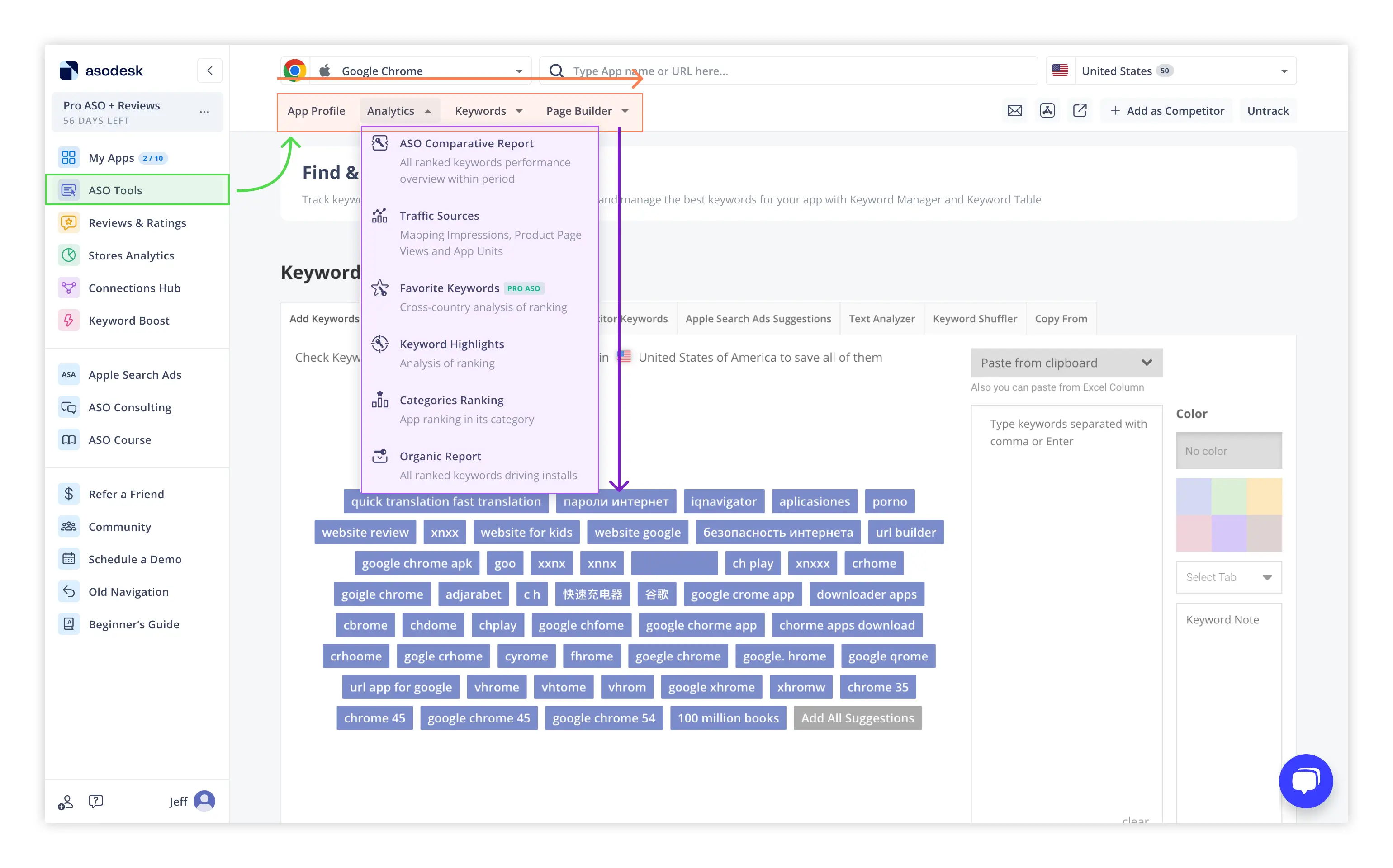
- The product offers tools for diverse roles such as ASO specialists, support staff, and app marketers. However, all these tools are located in the same interface, leading to visual clutter and an overload of unnecessary tools.
- There is a high barrier to entry with no internal education, making it difficult for newcomers to do the first steps in ASO.
These insights led us to conclude that the most effective strategy would be to revamp the navigation system. The new navigation system should meet the following criteria:
- Provide a way to segregate users and display only the relevant tools in each user's workspace.
- Align the user flow with the actual workflows of various specialists.
- Implement educational elements for each tool to explain its function and benefits.
- Implement best practices that are currently unused in the market.
Our next step was to prepare a blueprint for the client's team.
Implementation
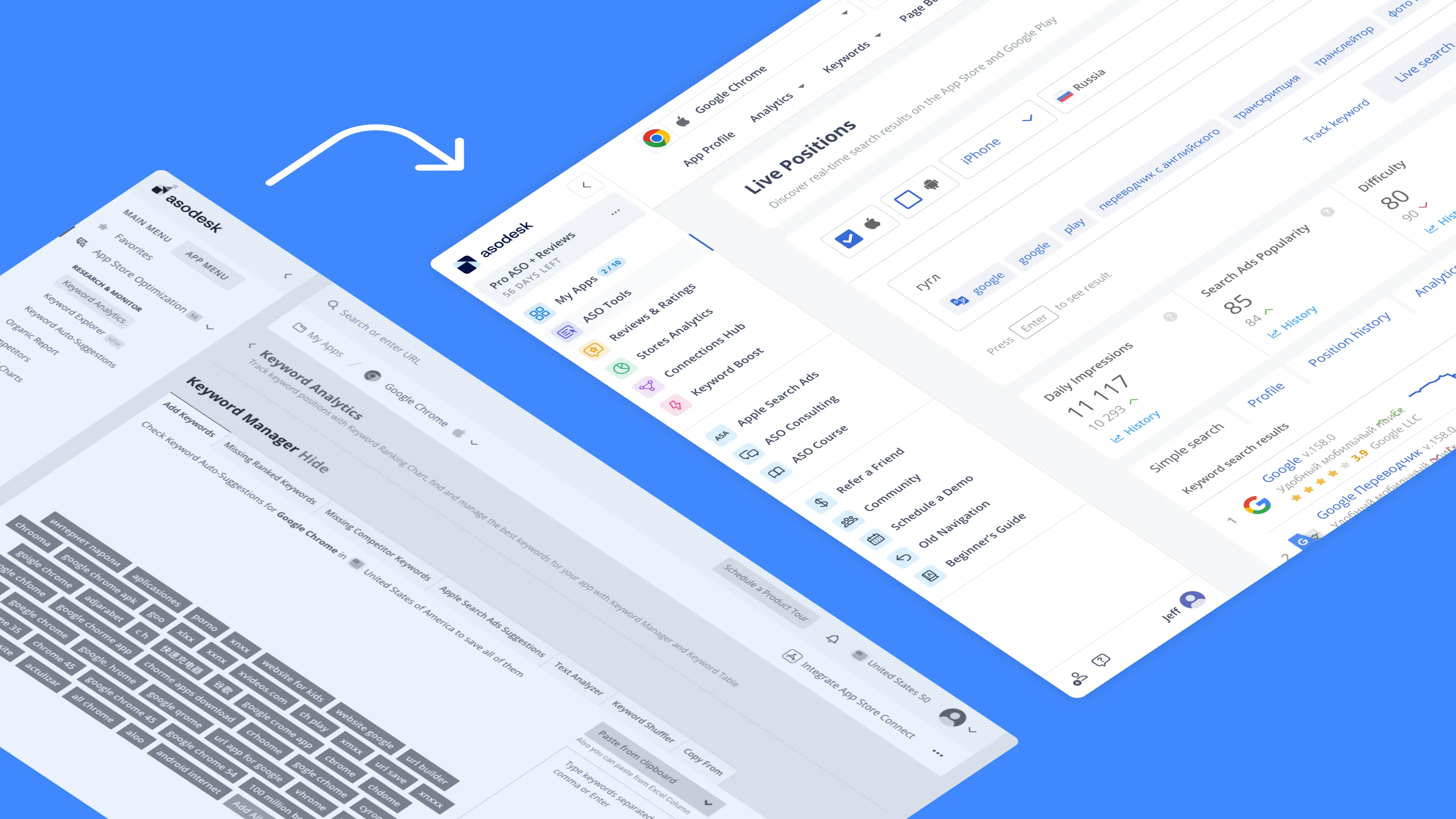
As an initial step, we prepared a prototype incorporating several key innovations.
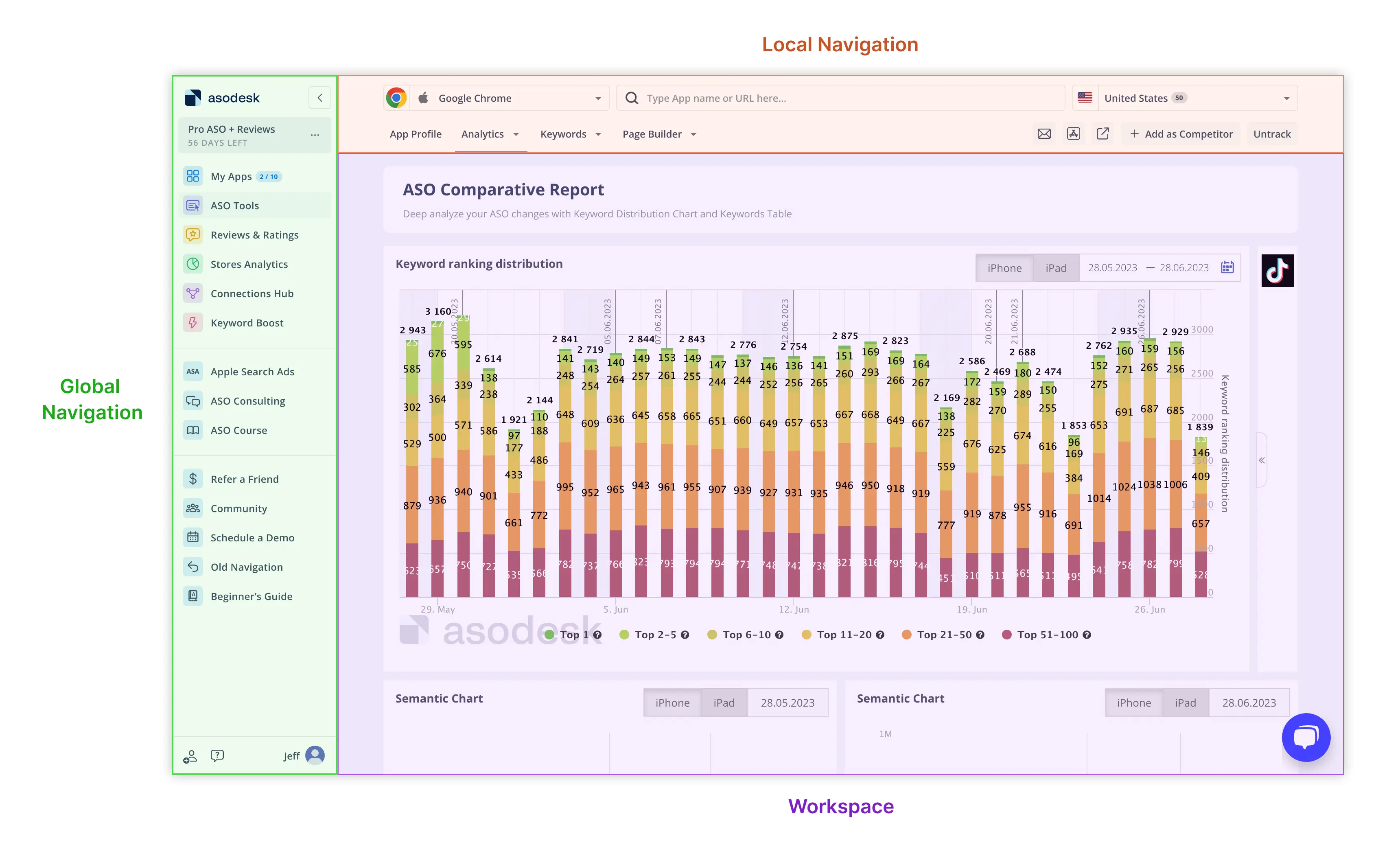
The first major change involved dividing the interface into three main zones:
- The Global Navigation segregates traffic among different specialists, providing overall product control and reducing user load by relocating specific tools to local navigation.
- The Local Navigation allows users to manage and search for apps, organizing tools by categories that reflect each specialist's workflow.
- The Workspace is the main tool interface where users engage directly with the tools.
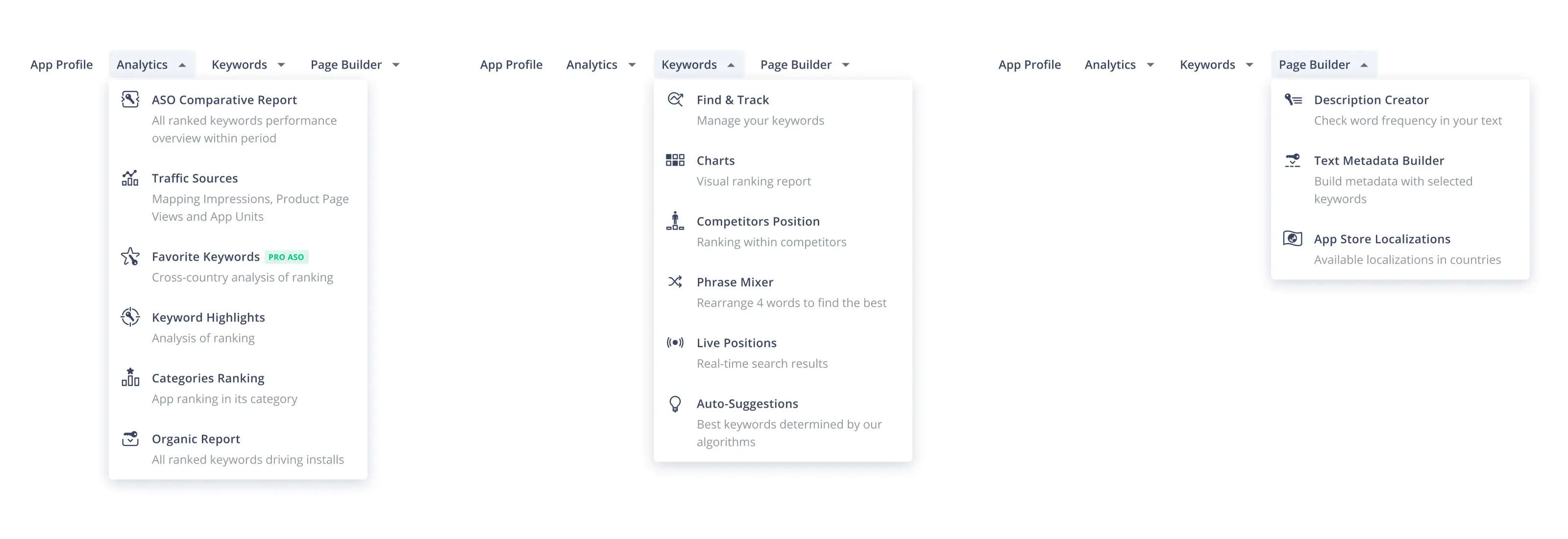
Another significant change was enhancing the Local Navigation. We conducted interviews with each type of specialist to map their workflows. This allowed us to categorize tools effectively and provide a brief description within each category to help both existing users and newcomers understand the purpose of each tool.
Following these changes, we developed functional prototypes in Figma. These prototypes are equipped with tasks that users can perform within a simulated real interface, enabling us to iterate and refine our approach efficiently and identify early issues. After several iterations, we observed significant improvements in speed, usability, and the success rate of task resolution.
Once we achieved positive results, we compiled documentation detailing all the logic, prototypes, analytics, and requirements for the client's design team. We worked closely with the team to create a design system, ensuring that the redesign would be scalable and meet all future requirements.
Outcomes
- We recorded a substantial increase in the conversion rate from the free trial to purchase, demonstrating the effectiveness of our redesign.
- The client's sales figures improved markedly as their sales team leveraged the redesign as a compelling selling point.
- Despite no technical changes to the platform, user feedback overwhelmingly indicated that the platform operated faster. This improvement in perceived performance was directly attributed to the streamlined and user-friendly navigation, which enhanced efficiency.
- We solidified communication between the design/product team and developers, significantly accelerating the pace of future updates and changes.
- We established a robust design system, laying a strong foundation for ongoing development.
- We successfully integrated best design and product practices within the client's team, resulting in improved performance and team synergy.