Introduction
Our client (NDA), an online store with over 500,000 products, recently pivoted to make their website the primary business driver, moving away from it being a secondary sales channel. A critical part of this strategy involved enhancing the user experience (UX), specifically by improving menu navigation, which we will refer to as the "catalog."
Within the client's product team, opinions were divided. Some believed the current catalog was adequate, while others argued that the category names were unclear and the vast number of categories detracted from the user experience. To resolve this dispute and determine the best catalog structure, our UX research team conducted an audit of the existing catalog to identify simplification opportunities and enhance user satisfaction.
Audit Overview
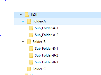
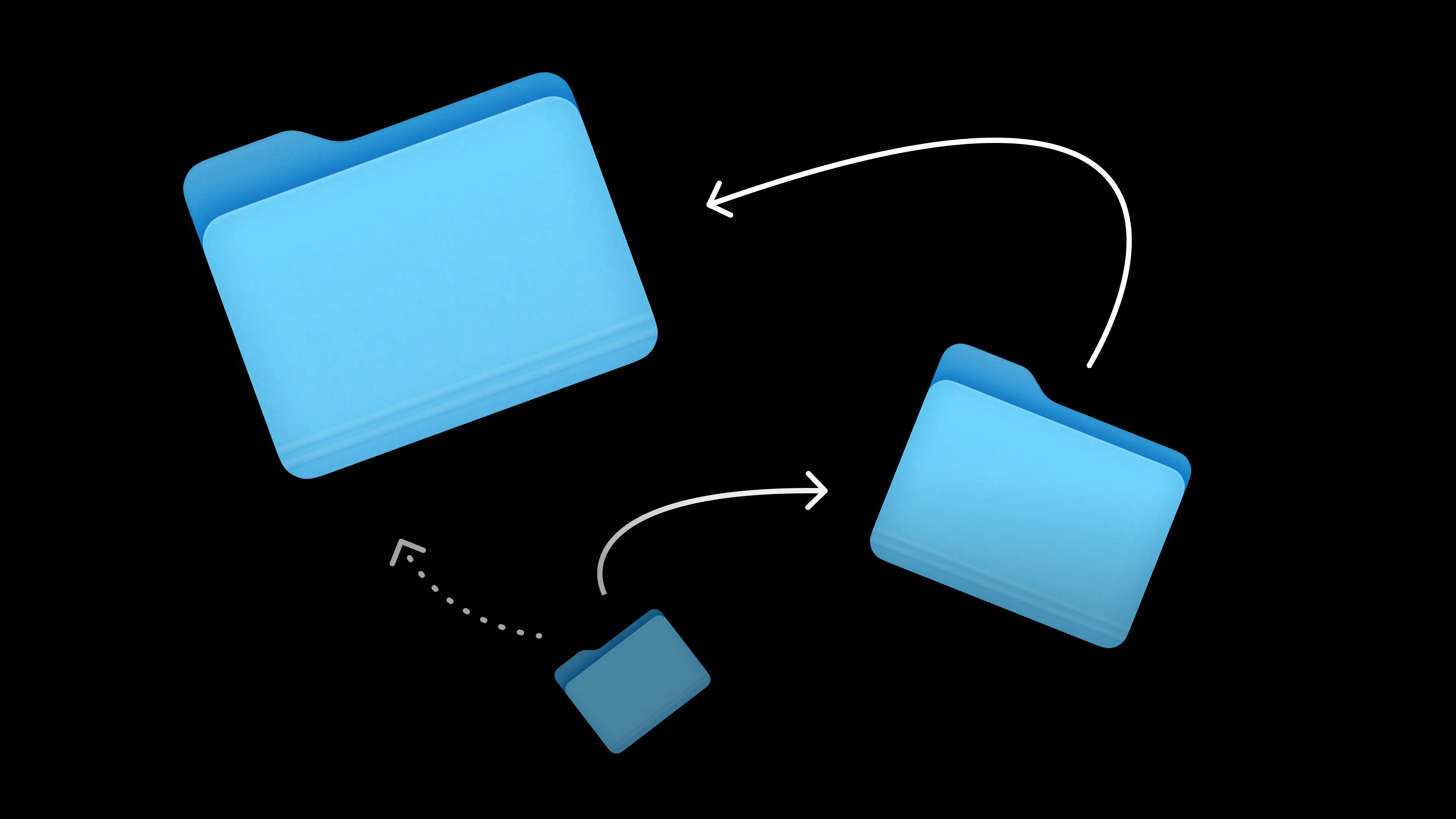
Before we begin, it's important to understand the fundamental concept behind any navigation system: it is structured similarly to folders on your computer, which can be visualized as a tree. In this study, we will refer to it as the "tree structure". Therefore, improving navigation involves altering the tree structure and changing the visual representation of this tree within the user interface.
To grasp the current state and discover the optimal tree structure, we conducted an audit using a two-phase research method:
- Card Sorting: We extracted level 2 categories from the catalog and asked users to sort these categories into groups. This helped us understand how users naturally organize products and identify which categories are most intuitive to them.
- Tree Testing: We created two versions of the tree structure: an initial version with 20 categories and a second, optimized version based on the results from the card sorting phase. We then tasked users with locating a specific category in each version of the catalog to evaluate which structure facilitated easier navigation.
Results
Preliminary Assumption: A three-tier catalog would streamline the search process and enhance user satisfaction.
1. Card Sorting Outcomes: Results from the card sorting task showed that users sorted cards into 6-7 categories. This suggests that the original catalog with 20 categories was too large for them.
2. Tree Testing Performance: The results of testing the catalog tree showed that the speed of reaching the desired category in the optimized version of the catalog decreased by 15%, the expected complexity of completing the task decreased by 20%, and the final complexity also decreased by 20%. This suggests that searching for the desired category in the catalog has become easier and faster.
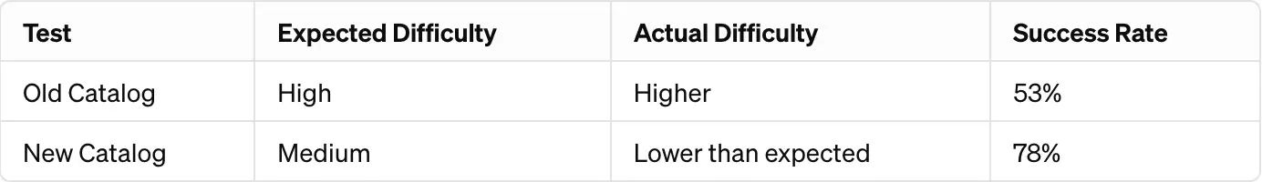
- Efficiency: The task completion time in the new catalog was 15 seconds faster on average.
- Accuracy: Initial correct clicks improved significantly in the new catalog.
- User Satisfaction: Reported difficulty was lower in the new catalog, indicating a better user experience.
We collaborated closely with the client's team to share the results, effectively resolving contradictions within their team. Together, we decided to reorganize the catalog in alignment with our findings. This restructured approach led to a notable increase in website conversions, as users could more easily and frequently find the right products in the catalog.