Introduction
Our client (NDA) is an online store that sells medicines, boasting over a million daily users and generating over USD 700 million in annual revenue (2023 data). Their current online store, launched in 2010, held a significant infrastructural advantage over its competitors at that time. However, over time, competitors gradually improved, and our client's growth began to slow down year by year, with competitors starting to take away market share.
The client's board recognized their outdated website as a threat to further growth and decided to develop a new store. We were hired to audit the UX of the current store and develop a plan for the new store, with support for the client's team in execution until the outcomes were secured.
Audit
We conducted a comprehensive audit of the client's current store to uncover actionable insights. During the audit, we used the following research methods:
- User Behavior Analysis: We delved into web analytics data to understand how users navigated the current store. This helped us identify areas of frustration and potential improvements.
- User Interviews: We conducted interviews with the client's users to gain a deeper understanding of their needs and expectations for the new store. By directly hearing their voices, we could tailor the online experience to their specific desires.
- Competitor Research: We analyzed the stores of key competitors to identify their strengths and weaknesses. Benchmarking against the competition allowed us to learn from their successes and avoid their pitfalls.
Analysis of user behavior and competitor research pinpointed the key issues and interviews with users confirmed these identified issues:
- Store Navigation Issues: Users frequently struggle to find the information they need on the website.
- Misleading Product Descriptions: The product descriptions on the website are often incomplete or inaccurate.
- Complicated Checkout Process: Placing an order on the website requires excessive time and effort.
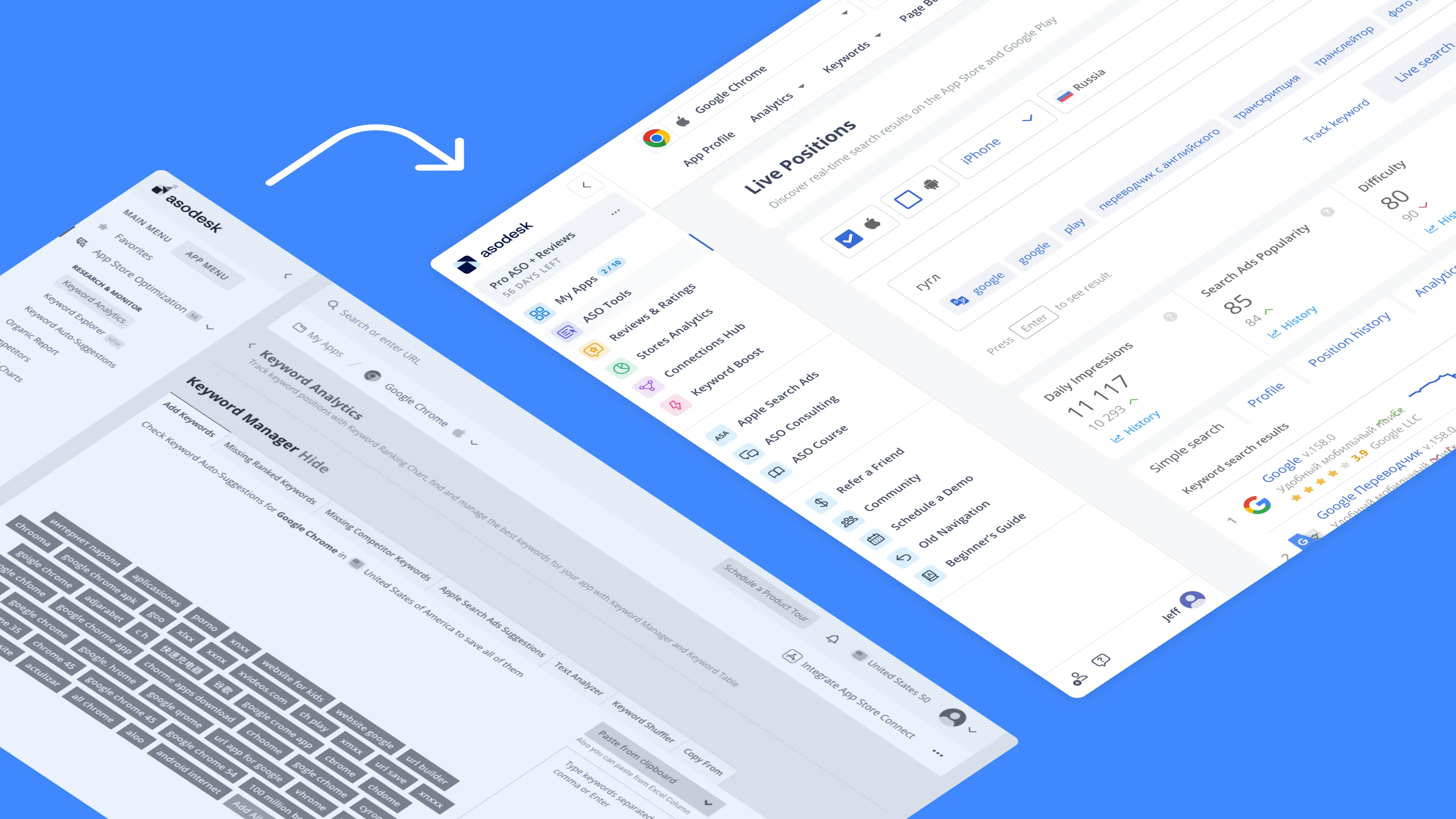
- Outdated UI: This diminishes the overall quality of the site experience.
This enabled us to prepare a comprehensive plan for the design and user flows of the future store.
Execution
To effectively support plan execution, we provided ongoing advisory services for the client's team until the desired outcomes were secured. This included:
- Facilitating workshops: We conducted a series of workshops with the design and development teams. Following these workshops, we presented our findings to them. While the team had a significant amount of work ahead, our guidance helped them gain a clearer understanding of the goals they needed to achieve.
- Demonstrating user research: We conducted a live demonstration of how to conduct user interviews. This allowed the teams to observe our data collection process firsthand and understand the types of conclusions that could be drawn from it.
- Building user empathy: By showcasing user interviews, we helped the teams develop empathy for the users. They began to see users not just as numbers in statistics, but as real people with unique needs and desires.
Results

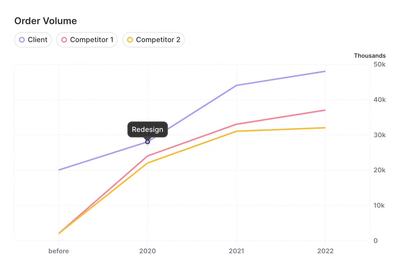
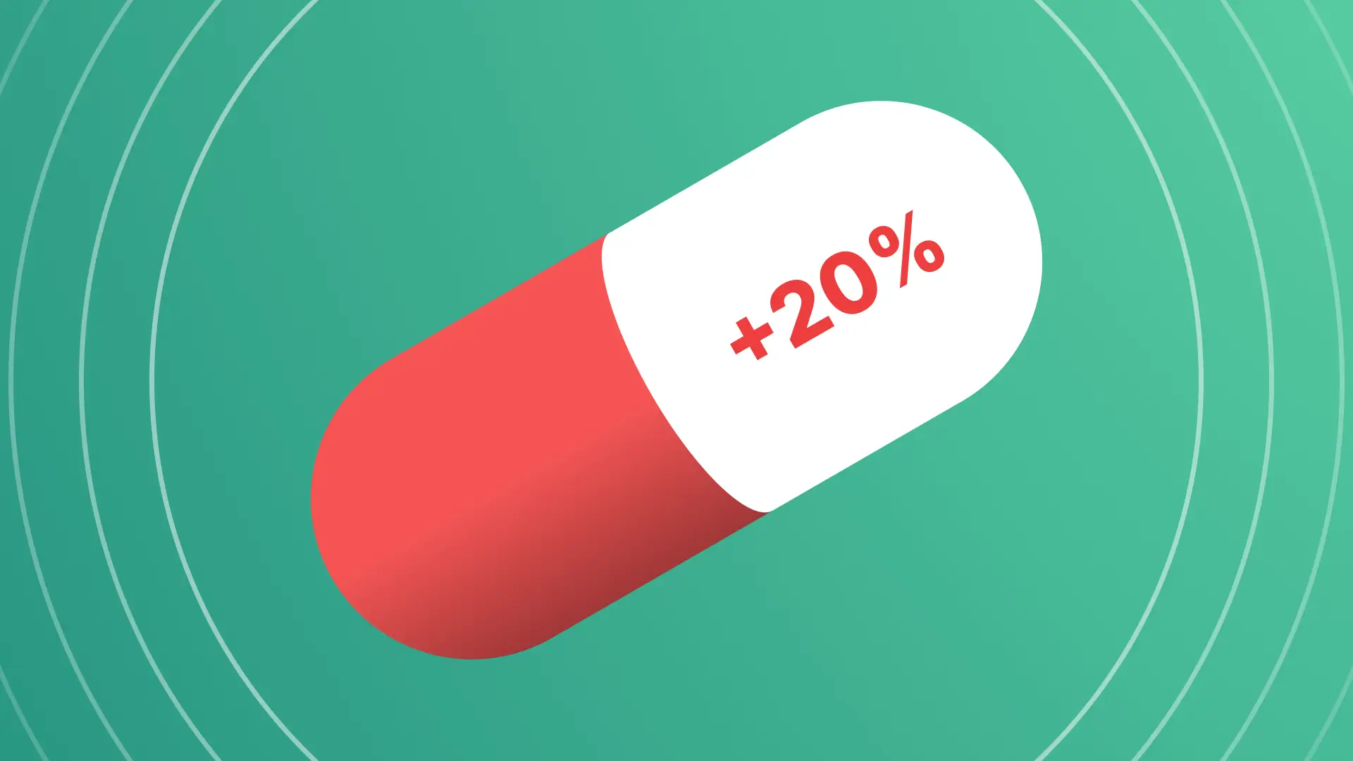
Under our close supervision, the new store successfully launched in May 2020. Web analytics revealed a positive impact following the launch: a 20% increase in conversion rate, a rise in repeat visits, and a surge in positive user reviews. These combined factors contributed to a significant growth in both revenue and order volume.


